
 "Why does the African Union want to ditch the world’s most popular map?")
The African Union (AU), a bloc of 55 countries representing more than 1.5 billion people, wants the world’s most popular map gone.
The organisation has endorsed a campaign urging governments, schools, media outlets, and international institutions to stop using the Mercator projection — a map first published in 1569 — and instead adopt alternatives that depict Africa’s actual size more accurately.
The AU’s move has added weight to a growing movement called “Correct the Map”, spearheaded by advocacy groups Africa No Filter and Speak Up Africa.
The campaign has pressed for the global adoption of the Equal Earth projection, unveiled in 2018, which provides a fairer sense of geographical proportions without the heavy distortions that have long plagued the Mercator.
The main complaint is that the Mercator map minimises Africa, portraying it as far smaller than it truly is, while inflating regions closer to the poles such as North America and Europe.
Critics argue this visual imbalance has shaped global perceptions for centuries, embedding stereotypes that cast Africa as marginal and less significant than its reality as the world’s second-largest continent by land area and population.
What we know of the Mercator map
The Mercator projection was developed by Gerardus Mercator, a Flemish cartographer, mathematician and engraver.
Published in 1569, it consisted of 18 sheets of paper forming a wall-sized map nearly four feet high and over six feet wide.
Unlike earlier projections, Mercator’s innovation was to arrange latitude and longitude lines so that compass directions corresponded to straight lines on the map.
Editor’s Picks
This breakthrough allowed sailors to plot routes using rhumb lines — constant compass bearings — simplifying long-distance navigation during the Age of Exploration.
While the projection was revolutionary for maritime travel, it came with a trade-off: severe distortion of scale. Landmasses close to the equator appear compressed, while those near the poles are stretched.
Africa and South America look diminished, while Europe, North America, and Greenland appear bloated. The equator itself runs through the middle of the map, but the visual impression consistently exaggerates the north at the expense of the south.
This distortion became a standard reference in classrooms, atlases, and later, digital maps, embedding itself in the way people around the world visualise geography.
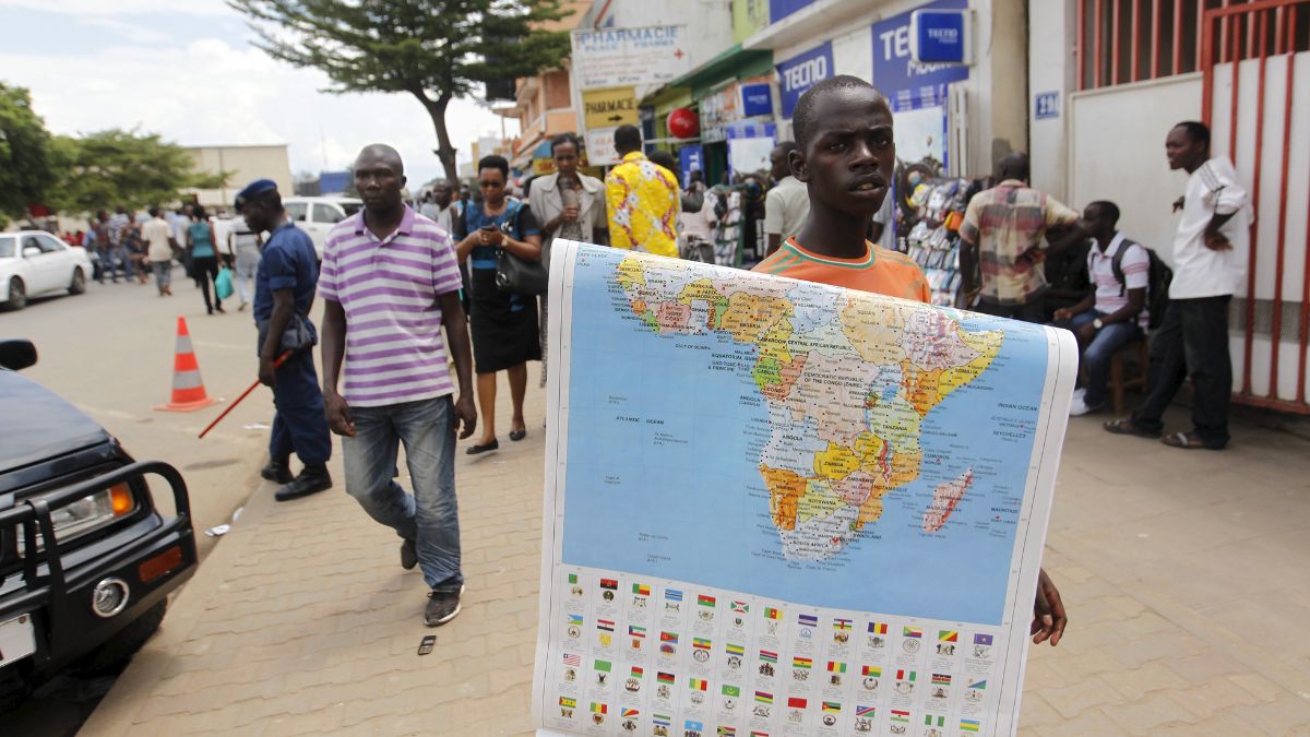
How Africa shrinks on the Mercator
Africa spans 11.73 million square miles, making it nearly three times the size of Europe. It is home to more than 1.5 billion people.
Yet, on the Mercator map, the continent is visually diminished to the point that Greenland — an island covering less than one million square miles with fewer than 57,000 residents — appears nearly equal in size.
This mismatch has been the subject of criticism for decades, often cited in academic and popular debates.
The contrast even found its way into pop culture, including a 2001 episode of the television series The West Wing, in which fictional cartographers campaign to replace the Mercator with more accurate alternatives.
How calls to adopt a true version of Africa have increased
“It might seem to be just a map, but in reality, it is not,” Selma Malika Haddadi, deputy chairperson of the AU Commission told Reuters. According to Haddadi, the Mercator fosters a false impression that Africa is “marginal,” despite its true scale and importance.
Moky Makura, executive director of Africa No Filter, called it “the world’s longest misinformation and disinformation campaign,” insisting that “it just simply has to stop.”
For Fara Ndiaye, co-founder and deputy executive director of Speak Up Africa, the implications are deeply tied to identity, stating that “it is more than geography, it’s really about dignity and pride. Maps shape how we see the world, and also how power is perceived. So by correcting the map, we also correct the global narrative about Africa.”
Ndiaye added that the campaign aims to change what children see when they learn geography in school.
“We’re actively working on promoting a curriculum where the Equal Earth projection will be the main standard across all (African) classrooms,” she said, expressing hope that international institutions, including those headquartered in Africa, will also adopt it.
The AU’s endorsement connects the campaign with larger themes of justice, historical redress, and global representation.
In an internal note, the organisation linked the initiative to its 2025 theme of “Justice for Africans and people of African descent through reparations.”
Rabah Arezki, a former World Bank economist, writing in Le Monde, argued that the Mercator projection historically served as a political tool.
“The standard projection was a political tool that contributed to the scramble for Africa, also known as the partition of Africa when Western European powers colonised the continent,” he wrote. “Just as making Africa look small and conquerable then, the Mercator projection makes the continent look small and irrelevant now.”
This framing resonates with leaders outside Africa as well. Dorbrene O’Marde, Vice Chair of the Caribbean Community (CARICOM) Reparations Commission, described support for the Equal Earth projection as a rejection of the Mercator map’s “ideology of power and dominance.”
What we know about the Equal Earth projection
The Equal Earth projection, introduced in 2018 by cartographers Bojan Šavrič, Tom Patterson, and Bernhard Jenny, was designed to preserve the relative size of continents more accurately while avoiding the heavy distortion of shapes seen in some alternatives.
Unlike the Mercator, Equal Earth portrays Africa in its true proportions, making its landmass visually dominant over Europe.
The campaign’s supporters want major institutions to embrace this projection. Requests have been submitted to the United Nations Committee of Experts on Global Geospatial Information Management (UN-GGIM).
The World Bank has said it already uses the Winkel Tripel or Equal Earth projections for static maps and is gradually moving away from Mercator in its digital mapping tools.
What challenges does Africa face
Despite progress, the Mercator projection remains deeply entrenched. In 2018, Google Maps shifted its desktop version from Mercator to a 3D globe model, ensuring that users could zoom out to see Earth’s continents in accurate proportions.
Yet on mobile devices, where the bulk of users access the service, the Mercator still dominates as the default view.
Even within Africa, campaigners point out, some AU-affiliated agencies continue to use Mercator-based maps on their websites.
Experts stress that the debate is not merely about aesthetics. According to analysis by Oxford Analytics, inaccurate cartographic depictions have broader implications for how Africa is understood in economic and political terms, reported Bloomberg.
“The distorted representation of Africa’s size could lead to an underestimation of the continent’s vast economic potential,” noted Jervin Naidoo, a political analyst at the firm.
“By accurately depicting Africa’s true scale, the campaign aims to reshape global perceptions, encouraging more informed investment decisions.”
This perspective suggests that changing the map could influence global investors, educators, and policymakers in how they view the continent.
Haddadi said the campaign is part of a larger effort of “reclaiming Africa’s rightful place on the global stage.”
Also Watch:
With inputs from agencies
End of Article


&description=Why+does+the+African+Union+want+to+ditch+the+world%E2%80%99s+most+popular+map%3F)