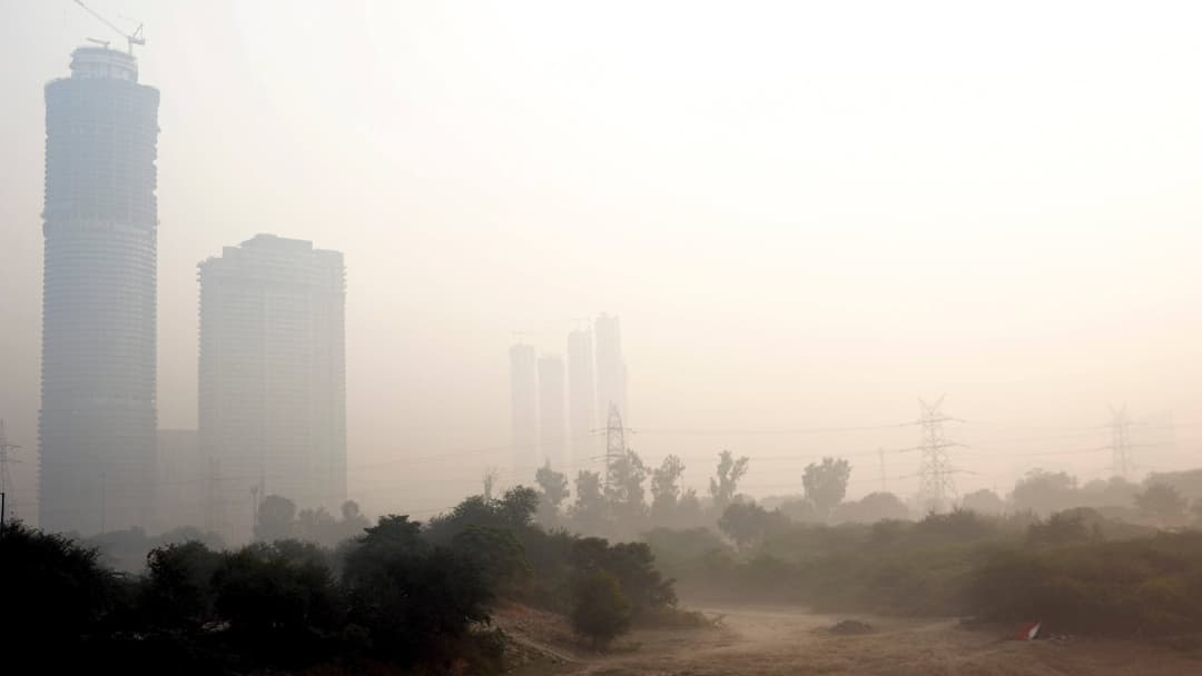
As winter tightens its grip on northern India, millions start their mornings with stinging eyes, a burning throat and an air quality check that often raises more questions than clarity. The familiar haze that settles over the region each year has once again revived a long-standing puzzle: why do different platforms give drastically different Air Quality Index (AQI) readings for the same location and time?
Government Apps Max Out—But Air Doesn’t
Platforms such as SAFAR and SAMEER, operated under government frameworks, rarely display values beyond 500. This is because the national AQI stops at that number—a limit fixed when the index was designed more than ten years ago to simplify communication of “severe” pollution episodes, as per a report on BBC. Anything between 400 and 500 is already considered dangerous for everyone, including individuals without pre-existing respiratory issues.
Yet private and international monitors paint a far bleaker picture. Tools like IQAir and various open-source platforms routinely show AQI levels pushing well past 600, with some readings even jumping above 1,000 during peak smog events. This stark contrast has fuelled widespread confusion among residents, as well as debates on data transparency and public health preparedness.
Why India’s AQI Stops At 500
Explaining the cap, Gufran Beig, founder director of SAFAR, has noted that the upper limit was intentionally set.
The rationale was that “severe” air quality would cause roughly similar health impacts beyond that point, and extending the scale could trigger unnecessary alarm. Because of this ceiling, official displays flatten extreme pollution events—treating AQI 501 and AQI 1,000 as identical, even though actual pollutant concentrations may be drastically different.
Different Tools, Different Numbers
The mismatch is also rooted in how pollutants are measured. The Pollution Control Board uses Beta Attenuation Monitors (BAMs), considered robust instruments that physically capture particulate mass. Meanwhile, many global platforms rely on sensor-based technology using laser scattering and electrochemical methods, which calculate rather than collect particle data. Both approaches have value, but they don’t always align—especially during dense winter smog.
The World Health Organization’s benchmark for hazardous PM2.5 levels—just 15 micrograms per cubic metre over 24 hours—differs sharply from India’s 60-microgram threshold. With each country applying its own classification system, comparisons across apps become even harder.
As the season’s smog thickens, what citizens see on their screens may depend largely on who built the scale, what instruments they use, and where each platform chooses to draw the line between “bad” and “dangerous.”


